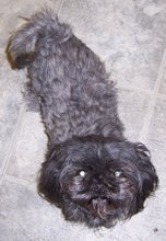
After seeing a bunch of these cards I decided I HAD to make one. I'm happy with how it turned out for the most part. I'm just not sure I like that you lose half the inside of the card (where the easel goes)...so there isn't much room to write. Other than that - it's a cute idea.

Here is the side view:

You can see why it's called an Easel Card more from this view. The brads on the inside hold the card front up for display. Also, you can tell from this view that I stamped his claws twice and popped them up with dimensional adhesive.
Enjoy.


2 comments:
Really cute Jane! I love this fold! When I made one, I just signed it on the back! Thanks for sharing! Hugs Lori
great job, Jane! it's a super cute card!
Post a Comment